
I was watching BBC Scotland bitesize with my daughter (which we are loving!) and they were explaining “the uses” of a pie chart and I nearly turned the TV off 🙈
Pie charts can look pretty, but in terms of visually communicating information there are so many better ways.
Before you produce any graph, you need to ask yourself what are you trying to tell someone?
Are you wanting to compare two lots of information?
Are you wanting to show that one number is bigger than another?
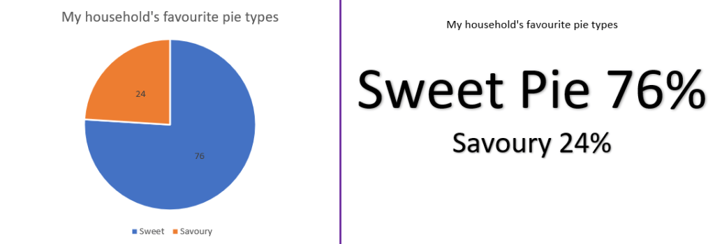
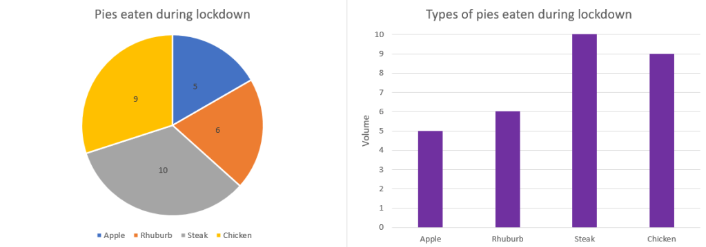
More often than not, by using a pie chart you end up knowing less about the data then if you had just a table of numbers.
As I said, pie charts can look pretty but if you just want a nice picture I would always prefer an actual pie 🙂
I’m always looking to learn, so if you have an example of a brilliant pie chart I would love to see it.

Leave a comment